
Winter Painting Tips for Homeowners
June 5, 2025
The Best Tips for Planning a Large Painting Project
June 19, 2025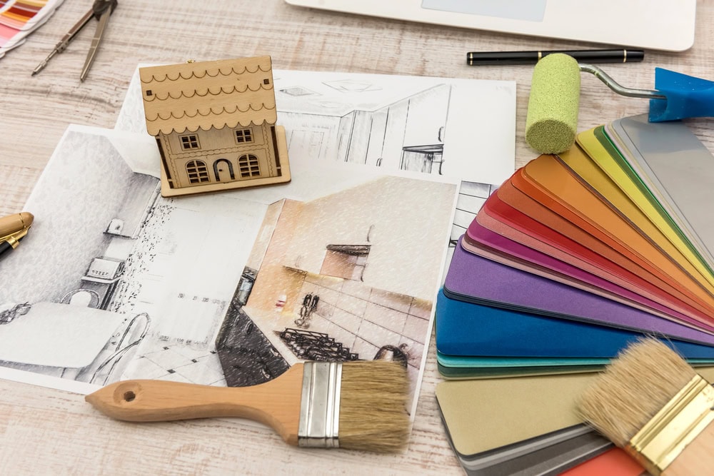
Overwhelmed by the myriad of paint colors available? Choosing the right shade can significantly impact the ambiance of your space. To ensure you make informed decisions, consider your room’s lighting, existing furniture, and personal style. Additionally, test samples on your walls to see how they look at different times of the day. Following these vital tips will enable you to create a harmonious atmosphere that resonates with your unique taste.
Key Takeaways:
- Consider the lighting in your space, as natural and artificial light can significantly affect how paint colors appear.
- Test paint samples on the walls before committing, observing how they look at different times of day to ensure you love the color.
- Think about the mood you want to create in the room, as colors can evoke different feelings and aesthetics.
The Psychology of Color: How Hues Influence Mood and Perception
Warm vs. Cool Colors: Setting the Right Atmosphere
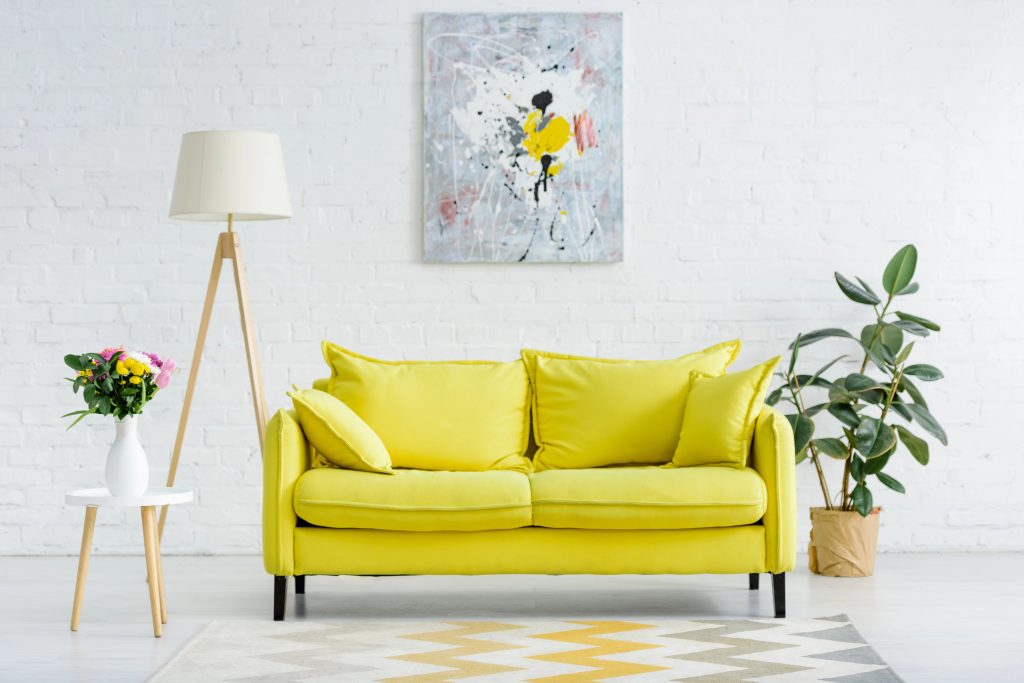
Warm colors, like red, orange, and yellow, are known for their ability to create an inviting and energetic ambiance, making them ideal for social spaces. In contrast, cool colors such as blue, green, and purple promote a sense of calm and tranquility, perfect for bedrooms or relaxation areas. By selecting the appropriate temperature of hues, you can tailor the atmosphere to evoke the desired emotions and enhance the overall energy of your space.
Color Schemes and Their Emotional Impact
The impact of color schemes extends beyond aesthetics; they profoundly influence your emotions and mental state. A monochromatic scheme, using various shades of a single hue, can instill feelings of harmony and balance, while complementary colors, which are opposite each other on the color wheel, can create vibrant contrasts that energize a space. Understanding these dynamics allows you to curate environments that reflect your personal style and affect your mood positively.
For instance, a triadic color scheme, combining three evenly spaced colors from the color wheel—such as red, yellow, and blue—can stimulate enthusiasm and creativity, making it ideal for a workspace or playroom. On the other hand, a split-complementary scheme, which uses one base color and two adjacent to its complement, can provide visual interest without overwhelming the senses. Selecting the right combination of colors based on emotional impact can transform a simple room into a place that speaks to your personal narrative and enhances your daily experiences.
Decoding the Language of Paint Samples: What to Look For
Understanding Undertones and Their Significance
Undertones play a pivotal role in how a paint color appears in your space. These subtle hues—be they warm or cool—can drastically alter the perception of the primary color. A beige with a green undertone may clash with the golden tones of your furnishings, making it important to identify whether a color leans towards pink, blue, yellow, or gray. By selecting colors with complementary undertones to your decor, you can create a cohesive and harmonious atmosphere in your home.
Sample Test Strategies: The Importance of Lighting and Context
Testing paint samples under different lighting conditions is vital to accurately assess their appearance. Natural daylight, incandescent bulbs, and fluorescent lights can each cast different tones on the color, so viewing your sample in the same light as your final application will yield the most accurate representation. Take the time to evaluate each option in various locations and times of day to see how changes in light affect the color, ensuring you make an informed choice for your space.
Sample Test Strategies: The Importance of Lighting and Context
Your walls can look entirely different depending on the lighting. For instance, a tranquil blue may appear vibrant in natural light but can reveal warmer undertones under artificial light. To truly understand how a color will transform your space, set up large paint swatches in the areas you plan to paint, preferably in spots that experience varying light exposure throughout the day. Observe them during morning, noon, and evening to catch any shifts. By doing so, you will gain insight into how your color choice aligns with the mood you wish to cultivate, allowing you to embrace a palette that feels just right.
Room Functionality and Color: Matching Shades to Purpose
Color Choices for Living Spaces: Comfort vs. Energy
For living areas, the balance between comfort and energy is imperative. Warm shades like soft yellows or earthy tones create a cozy ambiance, inviting relaxation. In contrast, vibrant hues such as bold reds or lively oranges can energize the space, promoting social interaction and lively discussions. Consider your lifestyle and how you want your living area to feel—do you prefer a sanctuary of calm, or a hub of activity with stimulating energy?
The Role of Color in Work Environments: Promoting Focus vs. Creativity
In work environments, colors play a transformative role, impacting focus and creativity. For productivity, cool blues and greens foster concentration and calmness, making them suitable for offices or study areas. Conversely, creative spaces thrive on energizing hues like bright yellows or vivacious purples, which can inspire innovative thinking and collaboration.
Understanding the psychology of color adds depth to your choices in work environments. Research indicates that blue enhances performance in tasks requiring concentration, while yellow can stimulate innovative thought processes. For instance, companies like offices set in vibrant shades to evoke creativity and collaboration among their teams. Whether you’re designing a home office or a creative studio, aligning colors with desired outcomes can significantly enhance your effectiveness in those spaces.
Harmonizing Existing Elements: Blending with Your Home’s Palette
Considering Furniture and Accessories: A Unified Look
Choosing a paint color involves more than just picking your favorite shade; it’s about achieving a cohesive aesthetic with your existing furniture and accessories. Consider the colors, textures, and styles of your furnishings—whether bold and modern or soft and classic. For a polished look, aim for colors that either complement these elements or create a delightful contrast, enhancing the overall space without creating visual chaos.
Architectural Features and Trim: Complementary or Contrasting?
Deciding on paint colors for architectural features and trim can significantly impact your home’s appeal. Think about the existing elements like moldings, baseboards, and doors. Opting for a complementary color can highlight these features, while a contrasting shade may add depth and interest. Both approaches can work, so consider your room’s overall style and your personal aesthetic.
In open-concept spaces, a harmonious color choice for trim can create a sense of flow, making the areas feel interconnected. For example, if you have rich wood accents throughout, using a light, muted tone for the walls alongside a deep, contrasting color on the trim can elevate the design while drawing attention to beautiful architectural details. If your home boasts traditional moldings, often a shade that contrasts softly with your walls will celebrate the craftsmanship without overwhelming the room. Paint offers a fantastic opportunity to express your style, whether you choose a unified look or a daring statement.
The Technical Aspects of Paint: Types and Finishes Explained
Understanding the different types of paint and their finishes can significantly impact your painting project. Choose wisely, as each type has unique properties that can enhance or detract from the overall look and durability of your work. Below is a breakdown of the most important options available:
| Paint Type | Characteristics |
| Latex Paint | Water-based, quick drying, easy cleanup. |
| Oil-Based Paint | Durable, provides a smooth finish, and has a longer drying time. |
| Primer | Preps surface, enhances paint adhesion, and covers imperfections. |
| Specialty Paints | Includes chalkboard, metallic, and anti-mold options. |
| Eco-Friendly Paint | Low VOCs, sustainable, minimal environmental impact. |
Assume that you want a balance of durability and ease of maintenance when selecting your paint type, as these factors can significantly affect your painting experience.
Paint Types: Latex vs. Oil and Their Benefits
Latex paints have gained popularity due to their ease of use and versatility. They are water-based, making them easy to clean with soap and water, and they dry quickly, allowing for faster project completion. On the other hand, oil-based paints provide a superior level of durability and a smooth finish that is highly resistant to wear, making them an excellent choice for trim and furniture. Recognizing the best option for your needs can save time and prolong the life of your paint job.
| Latex Paint | Benefits |
| Quick Drying | Allows for multiple coats in a single day. |
| Easy Cleanup | Soap and water are all you need. |
| Low Odor | More pleasant to use indoors. |
| Flexibility | Less prone to cracking and peeling. |
Exploring Finishes: Matte, Satin, and Gloss – Choosing the Right Sheen
Selecting the right finish can alter the perception of your painted surfaces dramatically. Matte finishes offer a soft, non-reflective surface that’s perfect for hiding imperfections, ideal for living rooms and bedrooms. Satin finishes provide a subtle sheen and are easier to clean, making them suitable for kitchens and bathrooms. Gloss finishes, while highly reflective and durable, are better suited for trim and details due to their high shine. A careful selection of sheen can elevate your space and enhance the color richness. Choosing the right finish has multiple implications for both aesthetic and functional attributes of your paint job. Matte finishes work well in low-traffic areas where you want a soft ambiance, while satin finishes are great for spaces where you may need to clean walls more frequently. Gloss finishes are quite reflective and can be used to highlight architectural features, adding a modern touch to your decor. By understanding how each type of sheen interacts with light and wear, you can make an informed choice that aligns with your vision.
Trends vs. Timelessness: Balancing Current Styles with Longevity
Analyzing Current Color Trends: When to Follow, When to Resist
Staying current with paint color trends can be exhilarating, but it’s vital to choose wisely. Trends like deep jewel tones or soft pastels can breathe fresh life into a space, yet they may not suit your long-term vision. Assess how the trend resonates with your personal aesthetic and your home’s architecture. If the trend feels authentic to you and complements your existing décor, it’s worth embracing; otherwise, holding back might be the smarter choice.
Creating a Timeless Space: Colors That Stand the Test of Time
Timeless colors like creamy whites, soft grays, and muted taupes create a classic backdrop that transitions effortlessly through seasons and style changes. These shades are versatile, pairing beautifully with a variety of accents and furnishings, minimizing the need for frequent repainting. Choosing enduring hues offers the freedom to update your décor without the pressure of matching trendy colors.
Creating a timeless space not only enhances aesthetic appeal but also can be a financially savvy decision. Neutral shades often create a broad canvas, allowing you to play with bolder furnishings, art, and accessories that can easily pivot with changing trends. For instance, a warm beige wall can harmonize with a contemporary rug or cherished vintage finds, keeping your space fresh while maintaining a cohesive look. Striking this balance ensures longevity in your design decisions, making your home feel both current and comfortably classic.
Expert Insights: What Professional Designers Wish You Knew
Mistakes to Avoid: Common Pitfalls in Paint Selection
Avoiding common mistakes can save you time and heartache. Many people rush into decisions based on a paint chip or a swatch without considering the room’s overall *natural light*, *furnishings*, and *existing colors*. Often, colors that look stunning on a small sample may become overwhelming or dull when applied to entire walls. Consider the *scale* of the space and how the color interacts with other elements; this insight can significantly enhance your selection process.
Top Tips from Interior Designers: Secrets to a Flawless Color Choice
Utilizing expert insights can elevate your painting project to the next level. Professional designers suggest sampling paint in the context of your home. Apply it to larger sections of the wall and observe how it evolves throughout the day under different lighting conditions. Additionally, selecting *complementary colors* and considering the *room’s purpose* can help ensure that your space feels harmonious and intentional. The key lies in taking your time to see how colors change before making final decisions.
- Utilize paint samples on larger wall sections.
- Consider the time of day for natural light adjustments.
- Think about the function of the space to guide your color choice.
- Engage with complementary colors for a balanced aesthetic.
- Be patient—take time with your selections.
As you refine your color choices, make sure to consider textures and patterns in your fabrics, flooring, and decor that can greatly influence how a *color* feels within a room. Designers recommend that swatches be assessed across various times of day. The consistency in your color palette will make your space feel more unified.
- Assess textures that influence the ambiance.
- Evaluate fabrics and patterns alongside your color choice.
- Ensure continuity with adjacent rooms for seamless transitions.
- Take your time—color is a lasting commitment.
- Incorporate personal style to make the space uniquely yours.
Practical Steps for Your Painting Project: From Concept to Execution
Preparing for Your Painting Project: Budgeting and Planning
Begin by assessing your overall budget for the painting project, considering not just the cost of paint but also supplies like brushes, rollers, and tape. A solid plan includes a detailed timeline that accounts for prep work and drying time, allowing you to effectively organize your schedule. Allocating an additional 10-15% of your budget is wise to cover unexpected expenses that may arise during the process, ensuring you stay on track financially.
Execution Best Practices: Techniques for a Flawless Finish
Adopt reliable application techniques to achieve a professional look. Using quality tools, like high-density roller covers and angled brushes, enables you to apply paint smoothly and evenly. Start with the edges and corners using a brush before rolling the larger areas to mitigate drips and lap marks. To avoid an uneven finish, maintain a wet edge during application by working in manageable sections, overlapping each freshly painted part with your roller.
For the best results, consider the two-coat rule—this often provides enhanced depth and richness of color. After your first coat is dry, assess the surface for uniformity and apply a second one if needed. Additionally, selecting flat or eggshell finishes can conceal imperfections better than gloss paints. With attention to detail and the right techniques, you can achieve a painting project that not only looks inviting but also stands the test of time.
Conclusion
Choosing the right paint color can transform your space, creating the perfect atmosphere for your home. By keeping these essential tips in mind, you’ll feel more confident in making a decision that you’ll love for years to come. If you’re ready to bring your vision to life, Frederick Painting is here to guide you every step of the way. Contact us today to start planning your next painting project, and let’s create a space that truly reflects your style and personality!
Q: What factors should I consider when choosing a paint color for a room?
A: When dicking out a paint color, consider the size and layout of the room, the amount of natural light it receives, and its intended use. Lighter colors can make a small space feel larger and more open, while darker shades can add coziness. Think about the colors of existing furniture and decor, as well as the mood you want to create. Test paint samples on the walls at different times of the day to see how they change with lighting.
Q: How can I effectively create a color palette for my home?
A: Start by choosing a main color that you love and want to use as a foundation. From this color, select two to three complementary shades that harmonize well. Consider using the 60-30-10 rule: 60% of the primary color, 30% of a secondary shade, and 10% as an accent color. Use swatches and samples to create combinations, and visualize them together in the spaces to ensure they maintain cohesiveness throughout your home.
Q: Is it necessary to use samples before finalizing a paint color, and how should I test them?
A: Yes, testing samples is a vital step in the painting process. Apply paint samples directly on the walls and observe them at different times of day to see how they interact with both natural and artificial light. Ensure you view the colors from various angles and positions in the room. Consider how each color looks within the overall context of your space, including surrounding furniture and decor, to make an informed choice.

Shawn Zimmerman started painting in the summer of 1991, the year before he graduated high school. Shawn decided to pursue his career in the family business and continued to develop his skills in the trade while also developing the necessary skills to manage the business. Shawn enjoys being outdoors, canoeing, camping, hiking, hunting, fishing and spending time with family.


