
2025 Interior Painting Costs in Frederick, MD: What Homeowners Should Budget
December 2, 2025
Best Season to Paint Interior Walls in Frederick, MD (With Humidity, Heating & AC Tips)
December 16, 2025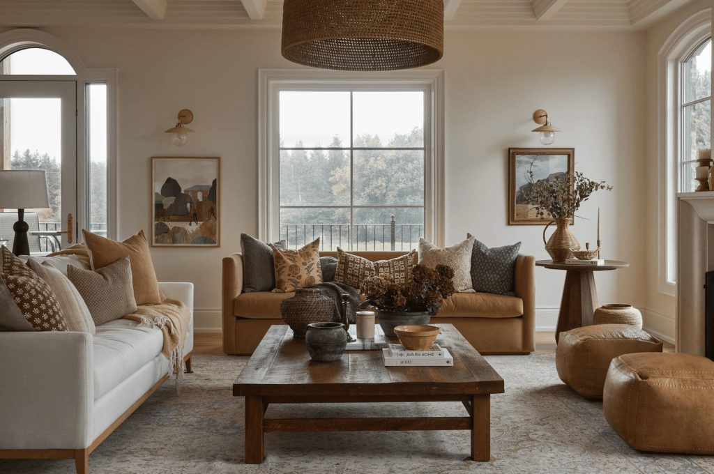
Frederick winters can feel long, short daylight, overcast skies, and colder temperatures that keep everyone inside. The right interior colors can make your home feel warmer, more inviting, and visually brighter from December through March (and those chilly April mornings). Below is a skimmable, homeowner-friendly guide to warm, cozy palettes that work beautifully in Frederick, plus nearby Washington, Carroll, Howard, and Upper Montgomery Counties.
Residential painting can help you bring any of these palettes to life with clean lines, durable finishes, and low-odor paints.
Why “warm” works better in our winter light
Northern light is cooler and flatter, and winter adds gray skies that can make true whites look stark and blues feel chilly. Warm colors—creams, clay-inspired neutrals, muted olives, honeyed beiges, cocoa browns, and blushes—bounce friendlier light and soften shadows. Pick hues with yellow, red, or warm green undertones to counteract cool daylight.
The cozy neutral spectrum (your safest winter bet)
Think of neutrals as a temperature scale. Slide warmer to create comfort without committing to a bright color.
- Creamy off-whites: Buttery, soft creams prevent the “blank” look of pure white. Great for open-plan spaces and trim when you still want a light, airy vibe.
- Warm beiges & oatmeals: Sand, ecru, and oatmeal bring gentle warmth that flatters wood floors and stone fireplaces.
- Greige with warmth: A taupe-leaning greige reads sophisticated and calm, especially with black accents and natural textures.
- Mushroom & putty: Earthy mid-tones feel plush in winter but are still neutral enough for year-round décor.
Where to use: Living rooms, primary bedrooms, hallways, and basements that need a lift without high contrast.
Earthy mid-tones that feel like a wool throw
Mid-depth, nature-inspired colors can feel like wrapping a room in a favorite sweater—cozy without being dark.
- Terracotta & clay: Sun-baked warmth that glows under lamp light; striking on an accent wall or a dining room.
- Olive, moss, and sage (warm side): Choose olives with yellow undertones rather than blue; they pair well with leather, brass, and walnut.
- Golden wheat & honey: Soft amber notes make north-facing rooms look sunnier.
- Mocha & cocoa: Velvety browns read luxe and calm; beautiful with cream trim and woven textures.
Where to use: Dens, libraries, dining rooms, and bedrooms where you want a cocooning effect.
Soft blushes and muted rosés (cozy without “pink”)
Dusty rose, blush-beige, and muted mauve can read neutral when grayed down. They warm winter light, flatter skin tones, and make small rooms feel welcoming.
Where to use: Guest rooms, powder rooms, breakfast nooks, and craft spaces. Pair with matte black or aged brass for balance.
Warm blues—yes, really
Blue can work in winter if you pick warm-leaning blues: think blue with a drop of green or a touch of violet-brown to take off the chill. Smoky denim, stormy teal, and slate-blue with taupe undertones are cozy—especially with camel textiles and warm wood.
Where to use: Bedrooms, media rooms, and bathrooms where you want calm without feeling cold.
Cozy color pairings that never fight your décor
- Cream walls + cocoa trim: Sophisticated contrast, especially with black frames and linen drapes.
- Wheat walls + olive accent: Earthy, modern mix for living rooms.
- Putty greige + terracotta feature: Warm focal point behind a sofa or bed.
- Mushroom walls + brass + walnut: Hotel-level cozy in a dining room or study.
- Warm slate blue + camel textiles: Classic, not trendy; perfect in primary bedrooms.
Finish and sheen choices that help in winter
- Matte/eggshell for walls: Hides minor drywall texture and keeps glare low in shorter daylight; eggshell offers easy wipe-ability for high-traffic spaces.
- Satin/semigloss for trim & doors: Crisp, durable edges that pop against warm walls without feeling harsh.
- Ceilings: Use flat to conceal imperfections; try a tinted ceiling (5–10% of your wall color) for a subtle, enveloping feel.
How to read undertones like a pro
Undertones decide whether a color feels cozy or cold. Hold your paint swatch next to a true white card and a known warm neutral. If the swatch goes ruddy or golden beside white, it’s warm; if it turns icy or lavender, it’s cooler. Always test swatches on two walls in north- and south-facing light.
Sample like a designer (quick method)
- Pick three candidates in the same family: a light, a medium, and a slightly darker tone.
- Paint 12×12 swatches on the two most different walls in the room.
- Check morning, midday, and evening; use lamps after sunset (how you’ll actually live in winter).
- Tape a plain white sheet beside the swatch to reveal undertones.
- Decide in 48 hours—don’t let your eye adapt for weeks and lose momentum.
Color strategies by room (Frederick & surrounding counties)
Living room/family room
- Choose warm light neutrals (cream, warm greige, oat) to bounce scarce winter light.
- Add a mid-tone accent (clay or olive) behind built-ins or the sofa for depth.
- Layer with walnut, rattan, and nubby textiles to amplify warmth.
Kitchen & breakfast nook
- Warm greige or wheat tones harmonize with stone counters and wood.
- If the cabinets are white, try mushroom walls to keep the room from feeling sterile in February.
- Brass hardware + warm pendant lighting = instant coziness.
Primary bedroom
- Smoky teal, cocoa, or muted rose creates a nest-like feel.
- For small rooms, go tone-on-tone: walls and trim within 1–2 steps of each other for a seamless wrap.
Kids’ rooms
- Keep it cheerful with cozy neutrals and a single lively accent (warm denim or mango).
- Eggshell sheen resists scuffs from winter play.
Dining room
- Lean bold: terracotta, olive, or cocoa makes meals feel intimate on long winter nights.
- Add picture lights and linen shades for a glow.
Basements & rec rooms
- Avoid cool grays—choose cream, putty, or warm greige.
- Use a layered lighting setup to avoid a “cave” feeling when it’s dark at 5 PM.
Trim, doors, and ceilings: the secret to cozy contrast
Warm walls pop against soft white trim; skip stark blue-whites. For an ultra-cozy envelope, paint trim and doors the same color as the walls but in satin—elegant and low-contrast, great for historic Frederick homes and modern townhomes alike.
Pairing with local architecture & materials
From historic farmhouses near Middletown to newer builds across Urbana and Walkersville, warm palettes flatter brick, stone, and classic millwork. In Washington and Carroll Counties, where you’ll find more exposed beams and rustic textures, earth tones and warm greens feel especially natural. In Howard and Upper Montgomery, with brighter contemporary interiors, oatmeals, mushrooms, and warm denim blues pair well with clean-lined finishes.
Lighting moves that make colors feel warmer.
- Bulbs: Use 2700–3000K LEDs for a cozy glow (avoid 4000K+ in living spaces).
- Lamps: Table and floor lamps at different heights soften shadows during early sunsets.
- Shades: Linen and parchment fabric shades filter light to a warm cast.
- Dimmers: Let you lean into evening coziness without changing bulbs.
Easy palettes you can copy this weekend
Soft & Bright
- Walls: Creamy off-white
- Trim: Soft white (not blue-white)
- Accent: Honey wheat or putty greige
- Metals: Brass or bronze
- Textiles: Camel, oatmeal, nubby ivory
Earthy & Elevated
- Walls: Mushroom or clay
- Trim: Cream or matching color in satin
- Accent: Warm olive
- Wood: Walnut or oak
- Textiles: Wool, bouclé, leather
Moody & Cozy
- Walls: Cocoa or smoky teal
- Trim: Same color, satin sheen
- Accent: Terracotta art or pillows
- Metals: Aged brass
- Lighting: Warm-dim bulbs, linen shades
How to avoid common winter color mistakes
- Mistake: Using cool grays in the basement or north rooms. They can look flat and cold. Choose warm greige or cream.
- Mistake: Picking white trim that’s too icy. Go with a soft, warm white so walls don’t look dirty by comparison.
- Mistake: Forgetting night lighting. Your winter palette must look good under lamps, not just midday light.
- Mistake: All accent, no base. Start with a warm neutral foundation; use mid-tones sparingly to prevent visual clutter.
Paint quality and indoor air during closed-window months
In winter, windows stay shut. Choose low-odor, low-VOC paints so rooms are usable faster. Upgrading to a more washable line pays off when salt, slush, and heavy use take a toll on entryways and hallways.
Prep and finish details that boost the cozy effect
- Fill nail pops and hairline cracks—smooth walls reflect lamp light better.
- Caulk trim gaps for crisp, shadow-free lines.
- Roll in the same direction and maintain wet edges to avoid flashing on warm mid-tones.
- Use quality rollers/brushes for softer stipple on matte and eggshell.
Seasonal maintenance: keeping walls beautiful through winter
- Spot clean high-touch zones monthly (switch plates, door frames).
- Use felt pads under winter gear racks and benches to protect trim.
- Run a humidifier to reduce static and help paint perform consistently.
Ready for a warm-up?
If you want color help or a quick, no-pressure quote, our team can sample, paint, and tidy with minimal disruption. See how residential painting can transform winter spaces while keeping your home comfortable and clean.
FAQs
What warm neutral works almost anywhere in Frederick homes?
A soft, creamy off-white or warm greige with subtle yellow or brown undertones flatters wood floors, brick fireplaces, and winter light.
How can I make my north-facing living room feel cozier without going dark?
Use a light warm neutral on walls, a soft white on trim, and add a mid-tone accent (clay or olive) on a feature wall or built-ins.
Are blush tones too trendy for long-term use?
Muted blushes with beige or taupe undertones read neutral and timeless when balanced with natural textures and black accents.
Do warm blues actually feel cozy in winter?
Yes—pick a green-leaning or smoky blue with brown/gray undertones and pair it with camel textiles and warm metals.
What sheen should I choose for busy hallways in winter?
Eggshell balances wipe-ability with a soft look; pair with satin on trim and doors for durability.

Shawn Zimmerman started painting in the summer of 1991, the year before he graduated high school. Shawn decided to pursue his career in the family business and continued to develop his skills in the trade while also developing the necessary skills to manage the business. Shawn enjoys being outdoors, canoeing, camping, hiking, hunting, fishing and spending time with family.


